12. Making your own book - Creating a cover
Viewing guide
Teacher to:
-
select and bring to the classroom a number of picture books that are new to the class
-
or alternatively organise to take the class to the library for part or all of a lesson as part of this activity.
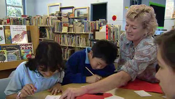
Students to:
-
choose a book that they haven’t read before based only on the cover
-
explain to the class why they chose the book and what makes the cover attractive
-
decide as a class on three or four attributes that are important for the cover of a book to make it attractive.
Students to:
-
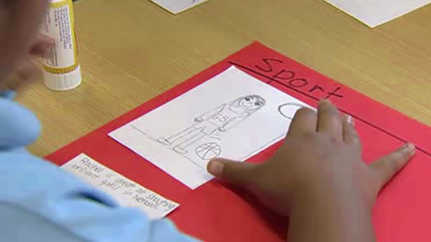
use ideas from Alison’s video on what makes a good cover, as well as the attributes decided on by the class, to design and create the cover of their book
-
complete a final copy of their book, printed out in colour where relevant
-
present their final versions to the school library for display, or in the school newsletter if digital.
This lesson is designed to help students complete their text and create an appealing cover that attracts their audience. Even if they are not creating a picture book they should still produce an appealing cover using elements of visual literacy. As the last activity in the sequence it is expected that students will have a complex book at the end.
Depending on the class this activity may take more than one lesson to complete.
The final product should be displayed to an appropriate audience. Hard copy books could be displayed in the school library or presented to a Stage 1 class depending on the targeted audience. Digital products could be shared via the school newsletter or website. As part of helping the students to be proud of their ‘done’ rather than ‘perfect’ work all work should be published in some manner.
Teaching visual literacy
This activity includes an opportunity to explore the concept of visual literacy with your students. Resources to aid your teaching are included here:
-
NSW Teachers Federation Hot Topic Library guides – scroll down for ‘Visual literacy’
-
Reading Australia article on teaching visual literacy for early learners that can be adapted
-
The Toledo Museum of Art – Visual Literacy website
-
Primary English Teaching Association Australia – article ‘The shape of text to come’
Learning intention
Completing this activity affords students the opportunity to:
-
communicate effectively for a variety of audiences and purposes using increasingly challenging topics, ideas, issues and language forms and features (EN3-1A)
-
use an integrated range of skills, strategies and knowledge to read, view and comprehend a wide range of texts in different media and technologies (EN3-3A)
-
think imaginatively, creatively, interpretively and critically about information and ideas and identifies connections between texts when responding to and composing texts (EN3-7C)
-
make artworks for different audiences, assembling materials in a variety of ways (VAS3.2)
-
communicate about the ways in which subject matter is represented in artworks (VAS3.4)
-
optional - Learning across the curriculum: Information and communication technology capability.
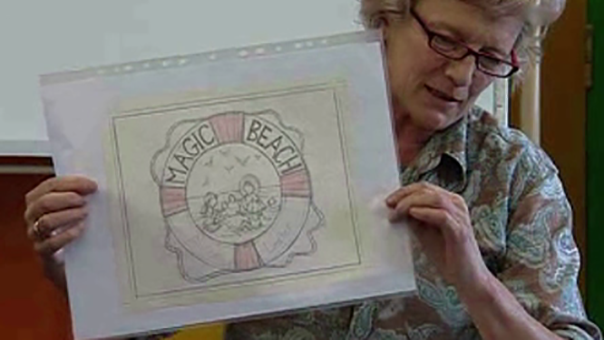
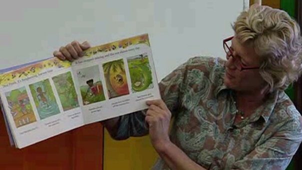
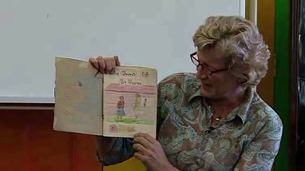
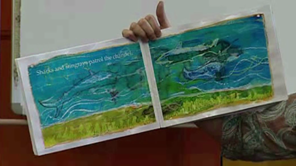
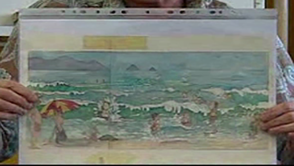
Alison Lester: This was my first cover for 'Magic Beach' - Magic Beach spelt in shells - and I actually did this as coloured artwork on watercolour paper but I've lost it and I just loved it, like, there were little purple cowries and little green starfish and orange shells and bits of seaweed. At this stage the whole book was finished and I'd taken all the artwork and the cover into the publisher. I live out in the country still, so I'd driven into the city and we were all standing around, the editor and the designer and me, going, 'Oh, wow, this is going to be such a nice cover. It's going to be a lovely book. Let's go and have lunch somewhere nice.' And just then Barry walked past, who was one of the sales team and he said, 'Oh, are you using that for the cover?' And we went, 'Yeah, what do you mean?' And he said, 'I've just had a really hard time selling a book that just had, like, words on the cover without actual pictures, I really don't think you should use that cover.' So we had to kind of think, well, he knows what he's talking about, we should be listening to him. So I went home a bit disappointed and came up with this cover, where the kids were playing in the middle of a circle and there was room to put 'Magic Beach' and my name and all the imaginary stuff was happening around the outside. And once again I'd drive back into the city pretty pleased that I'd got it done and I showed it to my editor, who's very tall and skinny and British and she has, you know people who leave big gaps in their talk so you get a bit nervous and you feel like you have to fill it in? She looked at it for a long time and she said, 'Well, it's very nice but we can't possibly use it' and I went 'Why not?' and she went and got 'The Journey Home', which is a book that I'd done the year before, off the shelf and pointed out that 'The Journey Home' had a mermaid in this corner, a pirate in this corner and a knight in this corner, so I was kind of really just doing the same thing again. So, I had to go home again and keep trying for the cover. Had this idea where it was like a life preserver. It looked too English; it looked more like 'Tim Goes to the Lighthouse'. And then here came back to the idea of a circle and I started playing around with all different patterns of shells and up here thought 'Aha, I know what I could do, I could have a picture from inside the book and just a border of shells around the outside.' And I felt so stupid that it'd taken me weeks and weeks to come up with that idea. And then at the very last minute the designer - I made the border of shells - she said 'I think it needs some colour behind it, they're just kind of falling off the white.' So I did a blue background and that was the book, the cover that we got. And this is a new edition, you can see we've changed it a little bit, like, the sky's gone, I think, hasn't it? We put sparkles on so, and a different font so it looks a little bit more modern.
Videos
1. Creating a class book - Introduction
2. Creating a class book - Planning
3. Creating a class book - Designing
4. Creating a class book - Drawing and writing
5. Creating a class book - Assembling
6. Making your own book - Telling real stories
7. Making your own book - Inspiration 1
8. Making your own book - Inspiration 2
9. Making your own book - Audience
10. Making your own book - Drafting
11. Making your own book - Characters