Overview
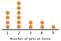
What are dot plots?A dot plot is a statistical chart made up of data points plotted as dots above a number line or category labels. Each value is recorded as a dot so that the freqdotuencies for each of the values can be counted easily. Dot plots are suitable when there are a small number of data values. It is an alternative to a column graph.
|
What are two-way tables?A two-way table organises data involving two categorical variables. Categorical data can be separated into distinct groups, such as colour, gender or type of housing. The categorical variables in the example below are gender and sport.
|

